Sabio Tarot · Decks and systems
Tarot Colors: Edition, Printing, and Interpretation
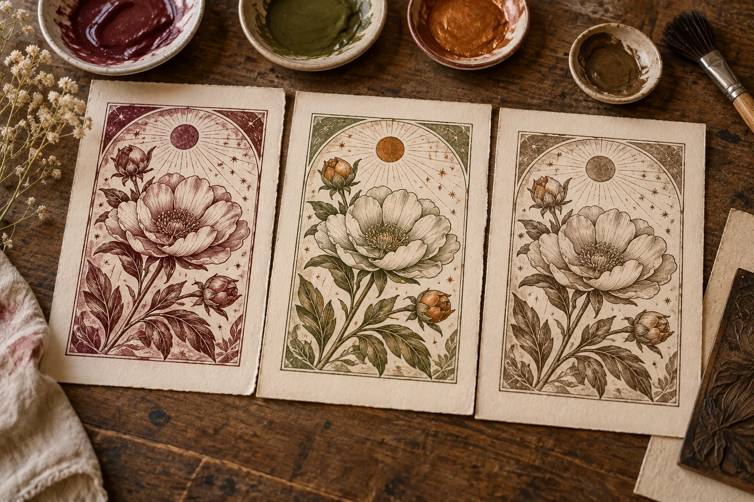
“Red means passion” and “blue means calm” are tempting shortcuts. They fail when the same form appears in several editions with different colors, when digital reproduction changes tone, or when color plays a purely compositional role. To read carefully, distinguish the color you observe, the technique and material state of the edition, and the interpretation you propose in a specific question. A color by itself does not demonstrate the querent’s emotional state.
A Controlled Comparison with Original Art
The illustration on this page, created for Sabio Tarot, shows three imagined printings of a flower with the same general composition. The first uses reddish ink, the second green and ochre, the third sepia tones. Because the main forms remain, you can ask whether the change of palette alters your first impression. Perhaps the red image seems more intense to you and the sepia one older. Those are associations of the observer, not historical properties of the motif or obligatory meanings of the tarot. The illustration does not represent three real editions of the same deck.
Do a written test: describe the flower without mentioning color. Then add a sentence about the effect of each palette. Finally, ask whether you would change the interpretation of a reading just because of that effect. If you answer yes, explain why the color is relevant to the question; if not, avoid using it as a decisive argument. The exercise shows how much the visual impression contributes, but it does not authorize attributing a theory of color to a historical artist.
The Color of a Card Is Also a Material Question
The BnF describes a tarot by Philippe Vachier from 1639 engraved in wood and colored with pochoir. The V&A brings together painted, colored, and lithographed cards from different periods. Those records document techniques and specific copies; they do not prove that every “Tarot de Marseille” had a single palette. To talk about the color of an old card, identify which object you are observing, its attributed date, technique, state of preservation, and whether you are seeing the original or a photograph. A color that appears on a screen may depend on light, capture, and monitor adjustment.
Do not infer from a difference in tone that a workshop intentionally changed the esoteric message. It may be a printing decision, a different coloring, wear, or a later reproduction; proving which one requires documentation. The same caution applies to contemporary facsimiles. Sometimes the publisher reconstructs lost colors. If that decision is documented, cite it; if not, present the difference as a visible observation and leave its cause open.
Fictitious Example: Color as a Secondary Clue
Invented example. Elena asks, “What should I review on my workshop’s poster before printing it?” She uses one of the imagined cards with a red flower as a visual stimulus. Her first association is “too much intensity.” Looking at the real poster, she discovers that all the elements compete for attention. She reduces two color accents and asks another person to point out the title at first glance. The card did not contain a professional evaluation of the poster; it helped formulate a hypothesis that was tested against the design file.
If she had seen the sepia version, perhaps she would have thought about low-contrast legibility. The test would still be to look at the printed poster and ask readers, not to assume that sepia has a universal meaning. The same task may receive different suggestions from different palettes; that is why it is advisable to record which image was used and what external data justified the change.
What a Screen Can Hide
If you compare two photographs of a card, do not declare “this edition changed blue to green” without checking capture conditions. An image may be lit with warm light, compressed, or digitally corrected. If you have authorized access to the objects, look at them under similar conditions; if you only have online records, cite the provenance and describe the color as it appears in that reproduction. Precision of the verb matters: “the photo shows a greenish blue” is not identical to “the cardmaker printed green.”
Visual comparison becomes even more delicate when a historical card was hand-colored. Two copies of the same design could have material differences. Do not claim that a variant proves a new doctrine just because the palette changes. The history of the technique needs sources from the object; symbolic interpretation may be creative, but it must be named as interpretation.
Suit Color, Character Color, and Background Color
Do not treat all the colors of the card as if they performed the same function. A tone may separate an object from the background, distinguish two garments, or guide the eye to the center. Before assigning meaning, record where it appears and how much space it occupies. In the flower of the illustration, the change affects petals and details; the forms remain the same. If the color changed only in a corner, perhaps it would not even be the center of the reading. A useful criterion is to ask whether another person would point out the same color without knowing your hypothesis.
If you study a Marseille edition and a Rider-Waite-Smith edition, the drawing differences are usually deeper than the palette. Do not reduce the comparison to “red versus blue.” Check whether there are figures, objects, numbers, or scenes that change. The V&A points out the importance of the illustrated scenes of the Rider-Waite-Smith minors; comparing them with Marseille numerals also requires looking at the visual structure, not only ink.
Three-Column Record
Write down observation: “in this reproduction, the flower is reddish.” Write down material source: “imagined original illustration” or “record of a museum object with described technique.” Write down possible reading: “for this question, the contrast makes me review what stands out.” If you do not know the cause of the color, leave the second column incomplete and do not invent a printer. The guide to relating card and position helps decide how much weight to give that clue.
Compare the three imagined color variants of the same motif. Keep the form constant and record how your attention changes with each palette. Then repeat the test with a documented historical object, if you can access authorized images, and avoid attributing the variation to a workshop technique without consulting its record. The first comparison teaches perception; the second requires material evidence.